The Art Of Choosing Color
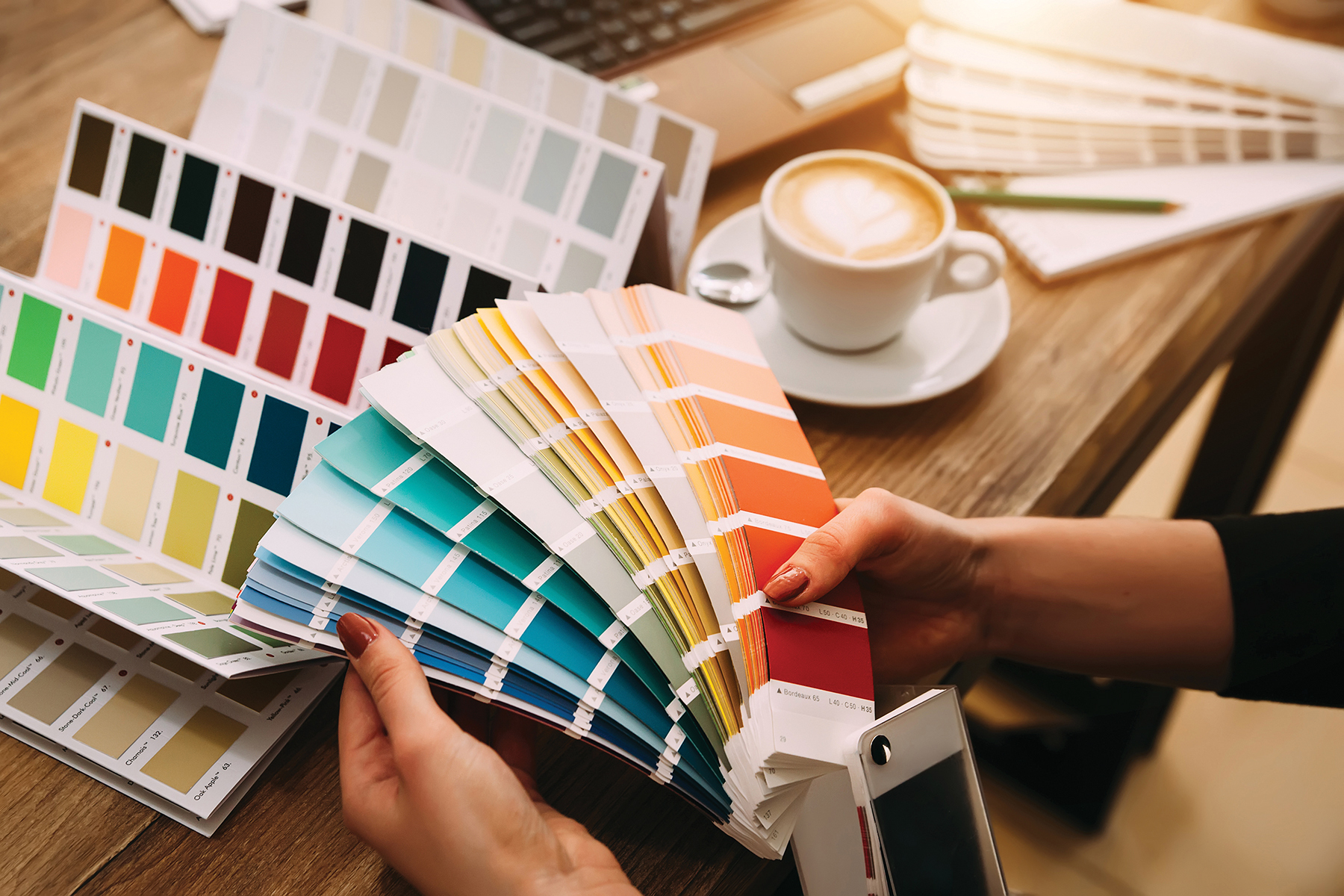
You know that feeling when you decide you want to transform a space by painting your walls, so you venture to the store to pick out swatches, become overwhelmed by the seemingly endless number of choices, and feel like you should give up before you even get started? If so, then you are certainly not alone in that sense of defeat. However, the art of choosing a paint color doesn’t have to be a guessing game. There are ways to approach paint from a more technical perspective that will help you reduce the number of options with more ease, and in less time. Consider Beethoven’s use of mathematics to create musical compositions: he was able to convey emotion and creativity while employing the objectivity of math. Following are tried and true ways for narrowing down your choices in a sea of colors you from which you have to choose.
Evaluate the space. As you perform an initial assessment of it, consider the following: Does the space get much natural light? Is your room north, west, east, or south facing? What colors already exist in this room? What kind of atmosphere do you want to create? Once you have the answers to these questions, you can better determine how these next steps can be implemented to find a paint color that works for you.
Undertones can make or break you
Why, pray tell, are there so many colors that look so similar? Actually, while paint color on swatches – especially lighter colors – can appear to be virtually the same, you need only to look at the bottom color on the swatch to see the differences. If the darkest hue is a color you would never use on your walls, chances are you will not like the lightest shade on your wall either. This is because darker colors on swatches show the true undertones of the color.
What is an undertone you may ask? Undertones are the result of blending colors together – and unless you’re looking for them, you may not even notice they are there. Undertones are important to understand because if you have a room with warm color furnishings and use a wall color with cool undertones, you will most likely not be happy with the result.
To determine the undertone, compare it to a true white or primary color: red, blue, or yellow. Warm paint colors possess pink, yellow, or beige undertones, while cool colors have blue, green, or purple undertones. If you are struggling to determine the undertone, you can often find the undertone of popular paint colors online.
The light makes the color
Light plays an important role in how a paint color will look in a specific space. Two aspects of how light affects the look of the color are the type of natural light and the Light Reflectance Value, or LRV.
If a room is north facing, it will receive the least amount of natural light. Cooler colors in this space may not be as inviting as warmer hues. In contrast, south facing rooms receive a steady amount of natural light throughout the day. East facing rooms will get light earlier in the day and west facing later in the day. Since the natural light will vary greatly in rooms facing east and west, you will need to look at samples throughout the day to see how the color changes.
LRV refers to the darkness or lightness of a paint color. While determining the LRV of a color is a complicated scientific process, you only need to understand the final LRV number to know how it will impact your space. LRV is based on a scale of 1-100. The darker the color, the lower the LRV and the lighter the color, the higher the LRV. A low LRV color will absorb much of the light. Light that hits a low LRV color will show its hue but will not bounce back or reflect. On the opposite end of the spectrum, a lighter color will not absorb light and will be much more reflective and bounce back off the walls, often causing the color to look much lighter, particularly in rooms that receive a lot of natural light. Since a lighter color is more reflective, it will pick up the colors surrounding it. As a general reference, 0-40 is a low LRV range, 40-60 a medium LVR range, and 60-100 a higher LRV range. You can find the LRV for each color on the paint manufacturer’s websites.
In darker spaces, if you use a color in a low LRV range, you will need a lot of artificial or natural light for the hue to show through. Otherwise, it will look darker than you expect. However, if you use a color with a high LRV to lighten the space, you have to provide the light to reflect it, or it will not produce the desired results. High LRV colors can be overwhelming if there is too much light in the space. They will also appear much lighter if they are reflecting a lot of light.
In summary, once you’ve assessed the lighting in a room and determined if you want warmer or cooler undertones in a space, you will have a much easier time narrowing down your options. Most paint stores will mix colors from other manufacturers; however, each paint company uses a different base to start the mix and the color you choose may not look exactly the same as if it was mixed by a store that carries that brand of paint. An example of this would be if you have Benjamin Moore White Dove mixed at a Sherwin Williams store, it will not look the same as if you had it mixed at a Benjamin Moore dealer. Once you have a handful of colors, the final determining factor should be using a large sample of each of the colors in the room, checking to see how they look at different times of day. When it comes to selecting color to transform a space, don’t be shy and always go with what you love the most.
Robyn Goss Bennai
Robyn is a local writer with a Bachelor of Science in Interior Design.