Color Therapy For Fiber Artists
Spring brings longer days, blooming flowers, and the perfect opportunity for a fresh start – including in your crafting projects. Just as nature transforms with vibrant colors, your knitting, crocheting, or decorative creations can reflect the same sense of energy and renewal. But color isn’t just about aesthetics – it has a profound impact on mood and mindset. From uplifting and energizing shades to calming, grounding tones, the colors you choose can enhance both your projects and your well-being. So, as you plan your spring stitching, why not be intentional about the hues that inspire and uplift you?
The Psychology of Spring Colors
Spring is often associated with soft pastels, fresh greens, and lively brights, each color evoking different emotions:
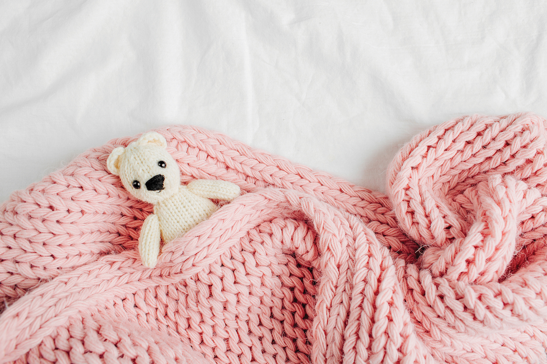
– Soft pastels (lavender, blush pink, sky blue, butter yellow, mint green): These colors feel light, airy, and fresh. They evoke feelings of serenity and hope, perfect for projects meant to bring a sense of calm, like a baby blanket, a spring scarf, or a set of decorative pillows.
– Brights (sunny yellow, coral, fuchsia, turquoise, lime green): These high-energy shades are invigorating and joyful. If you’re looking for a pick-me-up, bold colors can provide an instant mood boost. Try using them in accessories like tote bags, socks, or even a vibrant spring sweater.
– Earthy tones (sage green, terracotta, warm beige, soft gray, pale peach): These shades are grounding and create a sense of balance. If you love a nature-inspired aesthetic, these colors work beautifully for home décor projects, reusable market bags, or even a cozy knit wrap to transition into warmer weather.
– Monochromatic neutrals (cream, taupe, light gray, ivory): Neutral colors offer a sophisticated, minimalist vibe. They’re perfect for projects that feel timeless, like a simple lacy shawl or a textured knit sweater. To keep them from feeling too muted, pair them with a single pop of color, such as a bright edge on a neutral blanket or a pastel detail in a neutral-toned hat.
Color Theory in Knitting AND Crochet
Understanding color theory can help you make more creative and intentional choices in your fiber projects. Here are a few ways to mix colors effectively for a harmonious palette:
– Complementary colors: Opposites on the color wheel (such as blue and orange or pink and green) create a vibrant contrast. Use these combinations for statement pieces like striped shawls or multicolored tote bags.
– Analogous colors: These are colors that sit next to each other on the color wheel (such as blue, teal, and green), offering a cohesive and soothing effect. These hues are ideal for gradient scarves, ombre blankets, or soft-toned sweaters.
– Tonal variations: Working with different shades of the same color (like a range of blues from sky to navy) adds depth while keeping a project visually cohesive. Try this in a fade-style shawl or color-blocked sweater.
– Bright accents in a neutral base: If you love neutrals but still want a touch of color, add a pop of brightness, such as a neon pink edge on a cream-toned market bag or a coral trim on a beige cardigan.
Choosing the Right Color Combos
Not sure where to start? Think about what mood you want your project to evoke. Here are a few curated spring palettes to try:
– Sunrise serenity: A soft and relaxing palette of sky blue, blush pink, butter yellow, and soft lavender. Perfect for lightweight shawls, baby blankets, or lacy tops, it evokes early morning light and the gentle calm of spring.
– Garden bloom: A fresh and energizing palette of mint green, coral, fuchsia, and bright yellow. A great choice for crochet market bags, statement sweaters, or playful home accessories like pillow covers, this combo brings the energy of fresh flowers in full bloom.
– Cozy neutrals with a twist: A warm and grounding palette of taupe, cream, sage green, and terracotta. A wonderful choice for cardigans, scarves, or nature-inspired afghans, these tones are calming and reflect the earthy beauty of spring gardens.
– Coastal retreat: A crisp and refreshing palette of aqua, sand, soft white, and deep navy. Great for nautical-themed home décor, airy summer tops, or breezy knitted wraps, this palette brings to mind ocean waves and warm beach days ahead.
Spring is the perfect time to experiment with cheerful, mood-boosting hues. Whether you prefer soft pastels, high-energy brights, or grounding neutrals, the right hues can make your crafting experience even more enjoyable. So grab your favorite spring-inspired yarns and let color brighten both your project and your mood.
Heather Burns
Owner of The Knotty Sheep, offering all things knit and crochet.